Great brand color is a promise. But the moment that color leaves a style guide and hits real materials — paper, foil, fabric, corrugate, film — it starts to behave differently. Inks sink, coatings shine, stocks absorb, lights lie. Our job in Final Artwork and PrePress is to make sure your “one brand color” becomes a family of reliable, production-ready recipes that look the same to your customers, wherever they meet you.
What actually changes a color?
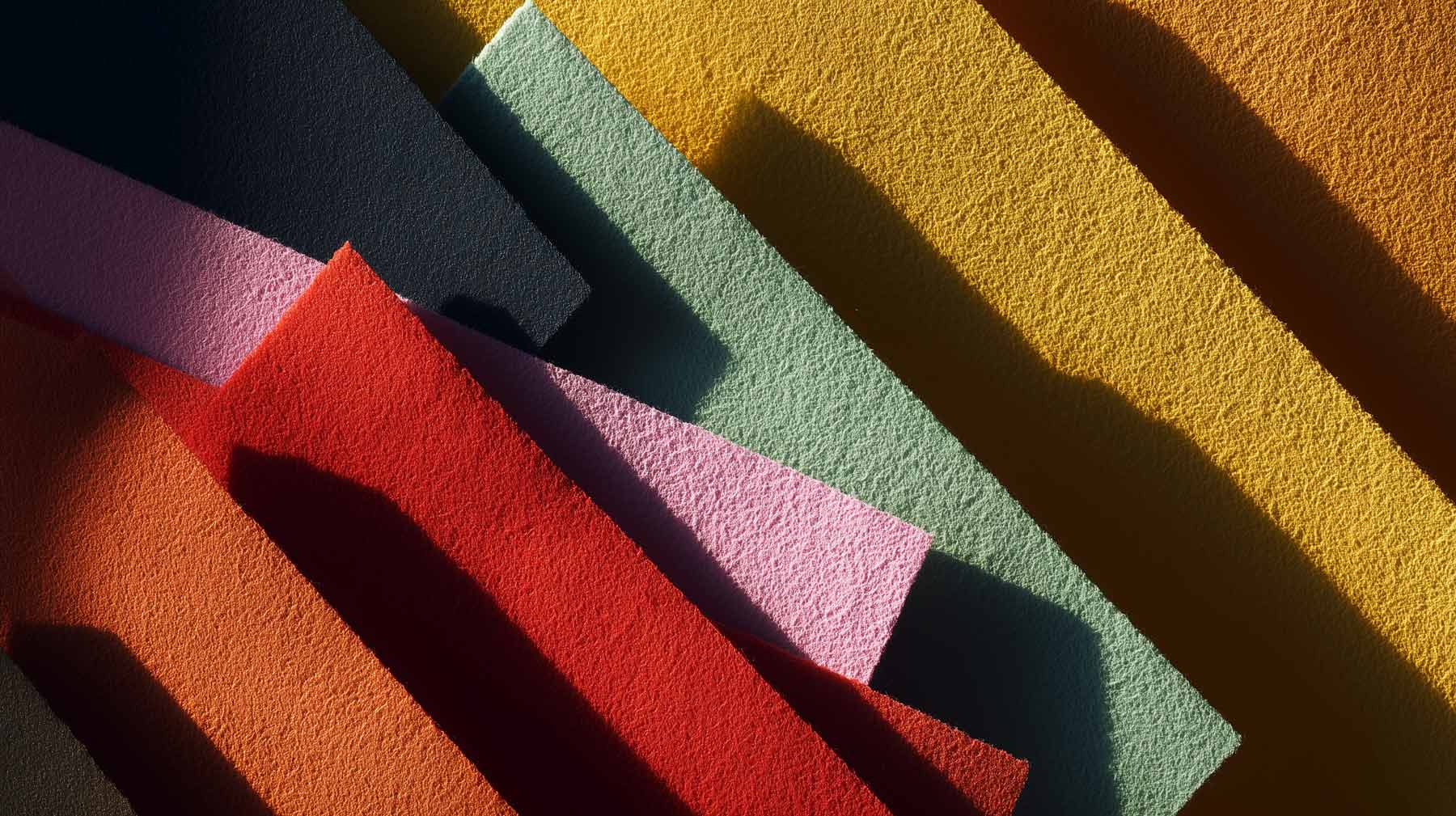
- Material (the “canvas”)
Coated paper keeps inks on the surface (brighter). Uncoated absorbs (duller). Kraft is brown (everything warms up). Clear film is transparent (colors wash out unless you add white). Foils and metallics cool or mirror the color. - Print method
Offset and digital behave differently to flexo, gravure, or screen printing. Each has limits on how bright, small, or solid your color can be. - Ink set
Standard CMYK can’t reach some oranges, greens, and purples. Spot colors (Pantone or custom mixes) and extended-gamut sets (CMYK+Orange+Green+Violet) go further. Solid foundations for this come from tight Colour Management. - Finishes
Gloss makes colors look deeper; matte diffuses light and softens them. Laminations and varnishes shift perception. - Lighting
Store LEDs, office fluorescents, daylight — each bends color in its own way. (We approve under the light you actually sell in.)
Three ways brand colors are built in print
1) Spot Color (Pantone® or custom mix) — the “give me exactly this” option
What it is: A single, premixed ink matched to a master standard.
Where it shines:
- Hero surfaces where color is non-negotiable (logos, big blocks of brand color).
- Difficult stocks (kraft, uncoated, specialty papers) where CMYK gets muddy.
- Metallics and fluorescents (only possible as spot or foil).
Where it struggles: Digital presses and many in-store digital prints can’t run spot inks. Extra ink stations add cost or aren’t available on some production lines.
Real-world example:
You have a bold retail orange on kraft shipper boxes. CMYK turns it brown-orange. We specify a spot orange and add a white underlayer exactly under the orange areas. Result: the orange reads vibrant on brown board, not rusty.
2) CMYK (process color) — the “everywhere, efficiently” option
What it is: Four inks (Cyan, Magenta, Yellow, Black) combine to simulate many colors.
Where it shines:
- Magazines, brochures, everyday POS — fast, efficient, repeatable.
- When you need consistency across many suppliers who only run CMYK.
Where it struggles: Some brand colors simply live outside CMYK’s range (vivid oranges, electric greens, punchy violets). These will print duller unless we adjust the target.
Real-world example:
Your fresh lime green looks great on screen but dies in CMYK. For catalog pages we create a CMYK-friendly cousin — still unmistakably your green, just tuned to what CMYK can do on that paper and finish. For complex tables or dense content, our Desktop Publishing (DTP) team makes sure legibility and color work together.
3) Extended Gamut (CMYK+OGV) — the “close to spot without extra spot inks” option
What it is: Adds Orange, Green, and Violet to CMYK, expanding the color range (great for those tricky brand hues).
Where it shines:
- Flexible packaging and labels where bright oranges/greens/purples are critical.
- When you run many SKUs together — EG can hit multiple brand colors in one pass.
Where it struggles: Not every printer has EG; it requires precise profiling and disciplined files (we handle this via tight Colour Management).
Real-world example:
A beverage brand’s deep purple and neon-leaning orange both miss in CMYK. On pouches printed CMYK+OGV, we match both without separate spot stations — keeping color impact high and unit costs sane.
How meterials change the story
- Coated vs. uncoated paper
The same corporate blue can look sharp and deep on coated, then soft and almost navy-black on uncoated. We set two approved recipes so both read as “your blue.” - Clear film & glass
Colors print transparent. Without a white foundation, your brand red reads like tinted glass. We add selective white where your graphics need opacity — and keep it off the parts meant to feel translucent. - Kraft & corrugate
Browns eat saturation. Pastels disappear; greens go muddy. We either switch to spot inks or raise chroma in the file and add a white base in brand-critical areas. - Metallic & reflective substrates
Printing CMYK on foil often looks too cool. We specify true metallic inks/foils for the premium bits and a separate, well-tested “flat gold” where metallic isn’t possible.
Bring us in early
Creative is stronger when production is in the room.
Loop us in at concept stage and we’ll flag material, color, and print risks before they harden into deadlines. In execution, the deadline is always on the horizon—we can help to remove surprises while there’s still time to solve them.
The colors that love to misbehave (and how we tame them)
- Vibrant Orange
Leans rusty on uncoated; too red in CMYK; flat on kraft; glows under warm LEDs.
Fix: Spot or extended-gamut for hero assets; white underlayer on kraft; approve under retail lighting. - Hero Red
Perfect on glossy materials, brickish on absorbent stocks; can look neon on some digital; washed out on clear film.
Fix: One “hero red” reference; tuned recipes per material; white backing on clear. - Deep Navy / Corporate Blue
Collapses to near-black in small text; drifts purple under cool LEDs, teal outdoors.
Fix: A readable navy for text and a hero navy for big areas; proof under mixed lighting. - Brand Purple / Violet
CMYK skews magenta/dull; on fabric it shifts blue.
Fix: Spot or EG for hero; textile-specific targets so merch and print agree. - Fresh Greens (lime / leafy)
Muddy on corrugate; many limes are outside CMYK; supermarket LEDs yellow them.
Fix: EG or spot where “freshness” sells; specify viewing light for approvals. - Pastels (blush, mint, powder blue)
Wash out on uncoated or matte-laminated finishes.
Fix: Stock-specific tone tweaks; finishes that keep gentle colors alive. - Metallic Gold & Silver
CMYK “gold” reads mustard; metallics cool the palette.
Fix: True metallic inks/foils for hero; define a companion flat gold elsewhere. - Neutrals & Greys
Pick up blue/brown casts from paper or lamination; shift under different lights.
Fix: Approve warm and cool neutrals and control finishes so the set feels related. - Solid Black
Big panels look charcoal on matte; small type can fill in on coated.
Fix: Separate blacks for text vs. large areas; finishes chosen for intended depth. - White on Non-White or Transparent
Colors vanish or tint on kraft, glassine, or clear film.
Fix: Add a white foundation exactly where needed.
How can you proof colors?
Drawdowns (ink on your actual stock)A simple swatch of the real ink on the real material. If that looks right, production can too
Contract proofs (calibrated prints)
Color-managed paper proofs that predict how CMYK or EG will print — signed off like a mini-contract. Part of our Prepress workflow.
Press checks & make-readies
For critical launches, we’re on press to nudge density, balance, and registration before the run.
Lighting you actually use
We check color under the light your customer will see — store LEDs, daylight, office — so there are no surprises.
What success looks like
- One master color, many correct versions
Your orange isn’t “one number” — it’s a small, controlled family of recipes that all read as “your orange” on different materials. - A practical color playbook
For each brand-critical touchpoint (packs, POS, print ads, vehicles, digital), we define the right ink build, stock, finish, and lighting for approval — plus when to use spot, CMYK, or EG. - Measurable, not mystical
Behind the scenes we measure and track tolerances, so “close enough” is defined — not guessed. That’s the foundation of solid Colour Management and bulletproof Final Artwork.
Want your color to behave?
If your brand relies on oranges, purples, fresh greens, metallics — or you simply need your color to match from magazine to mailer to shipper — this is exactly the kind of quiet, unglamorous work we love. Share your most color-critical pieces, and we’ll map the fastest path to consistent, believable brand color across every material and print type you use.