Layout
Make every page unmistakably on brand.
Clean, cohesive layouts that feel considered—not cobbled together.
If your team ships brochures, catalogs, one-pagers, sales decks or flyers, you need execution that never slips: typography that breathes, spacing that’s consistent, imagery that sits right, and pages that look like they’ve always belonged to your brand. We build layouts that respect your CI to the letter, match the tone of existing assets, and keep a coherent look across all formats and markets—so nothing reads “off” next to the rest of your materials.
Whether we start from your brand kit, past samples, or a creative route from another agency, our job is to translate intent into pages that are readable, polished, and ready to roll out—without design drift.
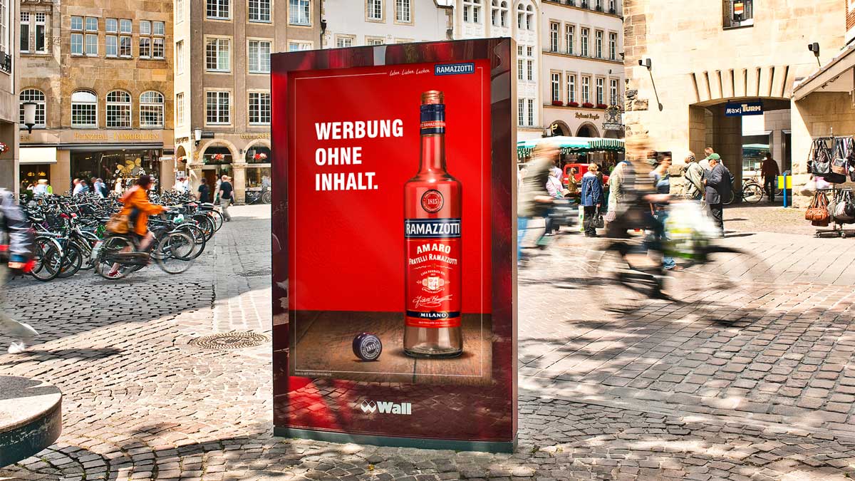
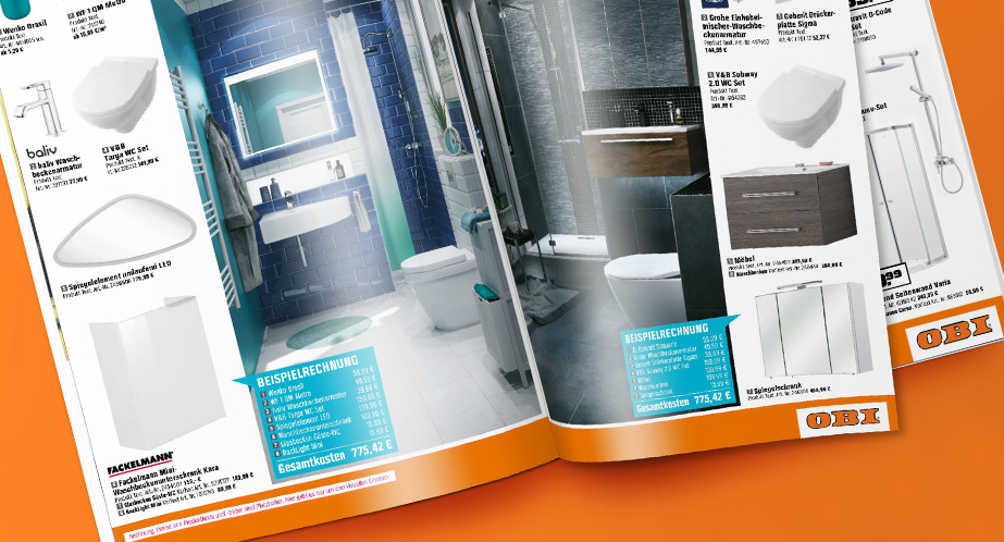
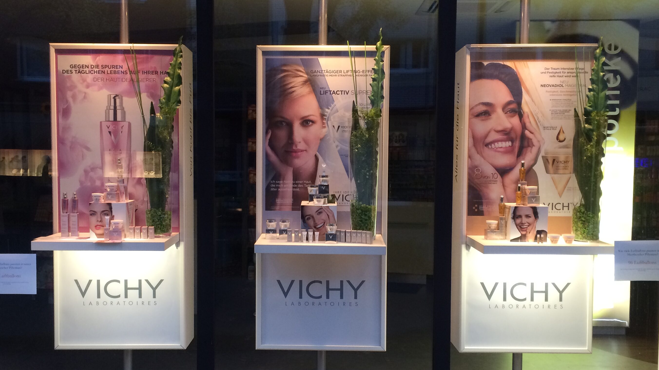
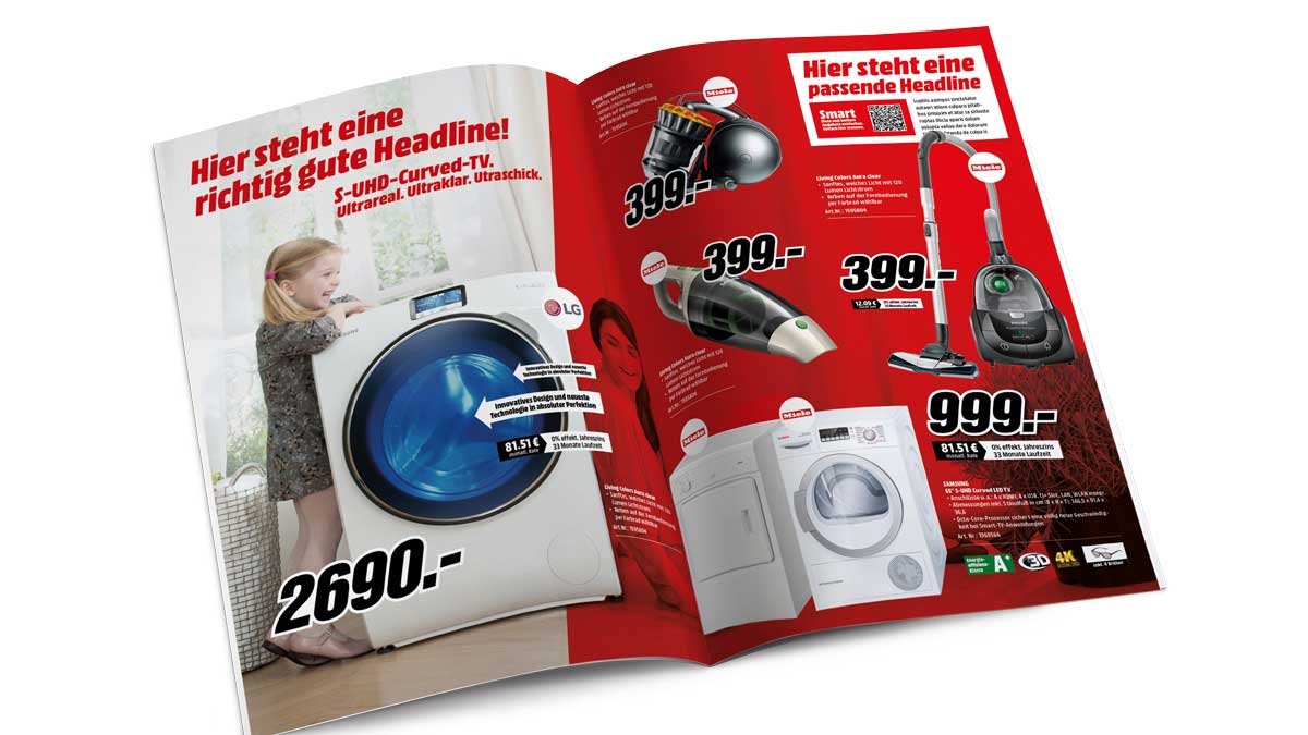
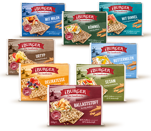
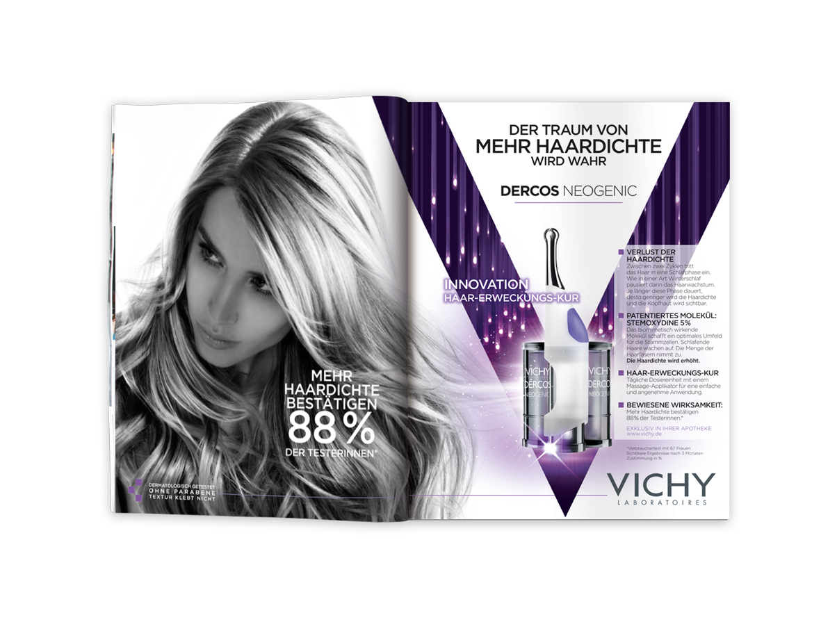
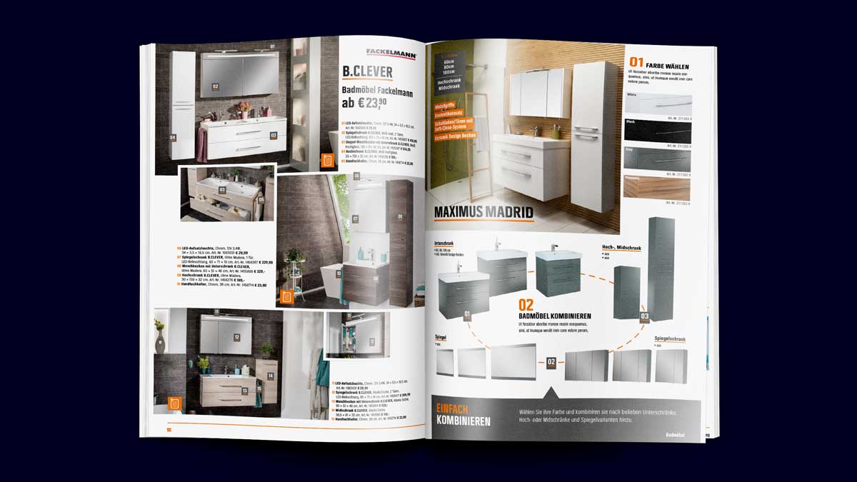
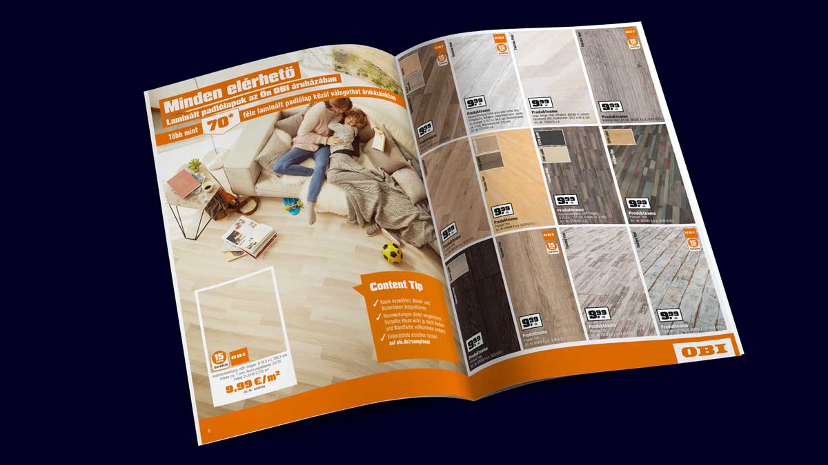
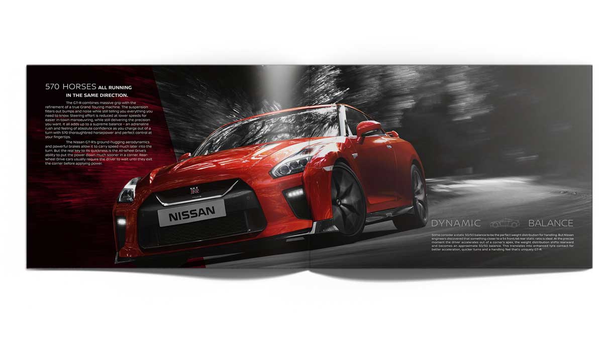



CI compliance or style matching
Available CD-Manual or not: We mirror your typography, spacing logic, image treatments, iconography, grid behavior and voice—so new pieces align with legacy ones and the brand feels continuous.
Cohesion across the whole set
Brochure, datasheet, insert, poster, pull-up—built as a family. Headings, callouts, tables and captions follow the same rules, so the set looks designed together (even when created months apart).
Senior craft in the details
Optical alignment, clean rags, hyphenation rules, widows/orphans, spacing rhythm, contrast and hierarchy. The “small stuff” that makes pages read smoothly and look professional.
how we keep pages clean, on-brand, and ready to ship.
Will it match what we already have, even if we don't have a corporate design manual? Yes. We audit existing pieces and document the patterns—then build to those rules so the new asset doesn’t stick out.
Can you work from supplied creative or copy decks? Absolutely. We turn routes, copy docs and brand kits into finished pages—keeping intent intact and elevating the execution.
What about multi-language versions? We plan for text expansion and line length from the start, so translations fit without breaking the layout or killing readability.
Our content is dense—tables, specs, footnotes. Can you keep it readable? Yes. We use governed table styles, clear hierarchy and page architecture that makes complex info feel effortless to scan.
Do you fix source issues (low-res logos, inconsistent icons, image crops)? We’ll flag and correct where sensible (rebuild vector assets, standardize icon sets, refine crops) to protect the final look.
How do you keep brand tone consistent across many pieces? With tone-of-voice guardrails, not copy-paste. We define voice attributes (e.g., confident, helpful, concise), message ladders, and vocabulary boundaries so every piece “sounds like you” without reusing the same phrases. Within those rails, we run A/B variations on headlines, openings, and CTAs to find top performers, and we adapt tone by channel and market while staying true to the core voice.
Need a layout partner that keeps things tidy, readable and on-brand—every single time?
Layout is where brand rules become real pages.
Reliable, senior execution for teams that ship a lot.
Layout is the operating system of your brand.
It’s what keeps every brochure, sales sheet, catalog page, and one-pager behaving like they belong together—no matter who made them, when they were made, or where they’re used. We build layouts that respect your CI down to spacing and type rhythm, match the look of legacy materials still in circulation, and stay readable even when content is dense or multilingual.
With us, nothing “goes off.” Headlines line up, tables make sense, images sit correctly, and the tone of voice remains unmistakably yours—even when market versions differ. We don’t chase awards here; we eliminate the awkward pages that undermine trust. The result: assets that feel considered, travel well between markets, and can be updated without breaking.
We start from what you already have and what you actually ship. We codify patterns, set guardrails for tone (not copy-paste phrases), and leave room for variation where it improves performance. That’s how you get consistency without sameness—and brand presence without the “template” look. If you need layouts that make your brand look competent, coherent, and ready for scale, this is where to start.
Similar Layout, Artwork & Repro services
01
Need an Independent Production Solution?
Let’s talk
+
TRUE BEAUTY is a concept ensuring creatives don’t just look nice. It is built on the fundamentals to understand your brand, your industry and your goals to deliver work that works. Work that improves your brand, differentiates you from your competitors and returns much more than it costs.
